| Intro 1 / Show House Details 2 / Tour Tips 3 / Shape 4 / Materials 5 / Structure 6 / Color 7 / Texture 8 / Size |
This category
is one of the best to observe at a show house. I have witnessed mind-boggling
color and color combinations. This is where good design explodes into
great design. 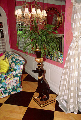 Color
can be used to accentuate, camouflage, or thoroughly define a space. Take
a long, hard look at the intelligent, creative uses of color.
Color
can be used to accentuate, camouflage, or thoroughly define a space. Take
a long, hard look at the intelligent, creative uses of color.
Here are some questions to consider during a visit:
What are the prominent colors? Is there a prevalent color scheme? Is there an immense use of color, or is it notable for its absence? Is color used as an accent or more broadly, to highlight a particular feature of the space? From room to room are the color palates similar or radically different? Are pale colors used more often than vivid, and how does this affect you? What color schemes are used for what types of rooms?
Look at how light is used to play off and enhance the color schemes. Observe the intensity and saturation of color. Note how it can be used to create excitement and harmony. Is color the dramatic part of the design story?
Previous / Intro /
1 / 2 / 3 /
4 / 5 / 6 / 7 /
8 / Next
Subscribe to our free and extremely informational newsletter. We would love to have your comments at: mail@designintuit.com
Welcome / What We're About / Focus on Showcases / Marco Polo's Quest / Michelangelo's Den / Great Sites & Sources / Reading / Tiles & Textures / Tools & Terms / Contact Us
This site design and text © DesignIntuit, 2001