The story of color in the 18th century varies broadly within the Georgian period style, depending on the year and the country. In general the colors went from a more subdued, narrow palate to a quite expansive bright expression. |
Intro 1 / Period Style 2 / Georgian History 3 / Shape 4 / Materials 5 / Structure 6 / Color 7 / Texture 8 / Size |
The
story of color in 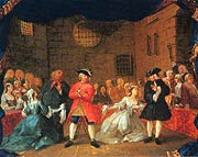 this period is really
one of form dictating function. In other words, the emerging
enlightenment and return to classicism coincided with necessity.
For centuries, English homes of wood and timber were dark with
little light and small living spaces. After the great Fire of
London, the building codes in England were established and materials
and forms were changed forever. Those building codes echoed the
very philosophies of the Georgian enlightenment. The buildings
of the new Palladian forms literally "let the light in".
From the numerous facades and Venetian windows to the open floor
plan, the format demanded a more natural, light color scheme.
this period is really
one of form dictating function. In other words, the emerging
enlightenment and return to classicism coincided with necessity.
For centuries, English homes of wood and timber were dark with
little light and small living spaces. After the great Fire of
London, the building codes in England were established and materials
and forms were changed forever. Those building codes echoed the
very philosophies of the Georgian enlightenment. The buildings
of the new Palladian forms literally "let the light in".
From the numerous facades and Venetian windows to the open floor
plan, the format demanded a more natural, light color scheme.
The new building types and color preferences coincided with new advances in paint technology and fashion. The paint production process was still costly and the materials rare. Limewash and Casein were still used primarily for walls and cheaper furniture. Fine furniture and paneling were still primarily of oak, which was never painted. However as oak became more expensive, it became fashionable to use paint over the paneling, woodcarvings, and furniture. At first it was used to cover up grains of inferior woods, then later on for protection from the elements. This brought about the use of brighter colors for interiors.
 The colors of the beginning of
18th Century Georgian Style were colors like "Prussian blue,
red lead, vermilion, and verdigris." (Living Colors, pg.45)
The colors of the beginning of
18th Century Georgian Style were colors like "Prussian blue,
red lead, vermilion, and verdigris." (Living Colors, pg.45)
By the mid 18th century, most Georgian London homes of the more affluent upper class began to use oil paints made from a mix of linseed oil, turpentine, and a ground pigment. The oil colors were more vivid and bright! This new brightness was of great use as more entertaining was happening and "polite society" needed to be lit for their follies.
Since
paint was expensive, the most brightly painted rooms were those
used for entertaining and show. Dining rooms, drawing rooms,
guest bedchambers, and center halls were lavishly coated with
 beautiful oil paints. When mixed
with the growing use of precious metals (candle holders, frames,
cutlery, etc.), reflecting mirrors, crystal and porcelain, the
effect was dazzling.
beautiful oil paints. When mixed
with the growing use of precious metals (candle holders, frames,
cutlery, etc.), reflecting mirrors, crystal and porcelain, the
effect was dazzling.
Our American counterparts of this time period didn't get all of this refinement. The colonial fashion-conscious had to import their earth pigments and linseed. Few craftsmen in the colonies were paint experts so new sets of fashionable colors were popularized. By using milk or buttermilk, some lime, and native earth pigments they created some very interesting and sometimes beautiful colors.
In general the colors move from muddy, medium values to more pure colors chronologically. As more paints (actually the pigment materials) were imported, the choices broadened and the colors were more saturated. The iconic color is probably medium to deep green. The color schemes of most Georgian homes were decided upon by what they could actually get their hands on, and not by personal choice. Probably the Analogous color scheme was most widely used in early Georgian Style and later the Tetrad. (Again, color choices were dictated by what was available, so this is tricky).
The story of the colors is not limited to just paint. We focus on paint since it is a single medium that can provide a great deal of information about style choices. However, fabrics and carpets were also very important color trend stories. As technology developed, chintz (printed fabric) became widely available and was very colorful. Rugs also made a big color impression, first the imported rugs from the Orient, and then the hand knotted rugs from England set striking new color schemes.
Carved wood and plaster were also part of the overall color scheme and will be addressed in the Materials and Texture sections.
Previous / Intro /
1 / 2 / 3 /
4 / 5 / 6 / 7 /
8 / Next
Subscribe to our free and extremely informational newsletter. We would love to have your comments at: mail@designintuit.com
Welcome / What We're About / Focus on Annapolis / Marco Polo's Quest / Michelangelo's Den / Great Sites & Sources / Reading / Tiles & Textures / Tools & Terms / Contact Us
This site design and text © DesignIntuit, 2001